
 |
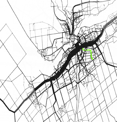
The map on the left is from the City of Ottawa's EMME/2 tool using 1995 traffic data. It shows the daily emissions per roadway for the Ottawa-Gatineau area. The volume of emissions on a road is represented by the thickness of the line. The Queensway is easily identified as the thickest line on the map (running roughly diagonally from the lower left to upper right). The next biggest segment is all of the roads in the centretown core seen as a solid black square just above the Queensway where it is thickest. The reason the Queensway and downtown produce the highest volume of emissions is because of traffic volume and congestion. The green squiggle below the Queensway and downtown is the Alta Vista Corridor. In the morning rush hour, traffic from a proposed roadway in the Alta Vista Corridor is destined for either downtown or the Queensway, which are the two areas least capable of accommodating more traffic. |
From the computer simulation of the morning rush hour we see additional greenhouse gas emissions from 5 to 9 metric tonnes a day with a four lane roadway compared to a do nothing option. Likewise do nothing produces fewer pollutants than a four lane road. The additional emissions in the 4 lane road case are due to both:
- reduced performance of the road network (due to having added road capacity in the wrong places)
- induced traffic as forecast by computer simulation of the morning rush hour.